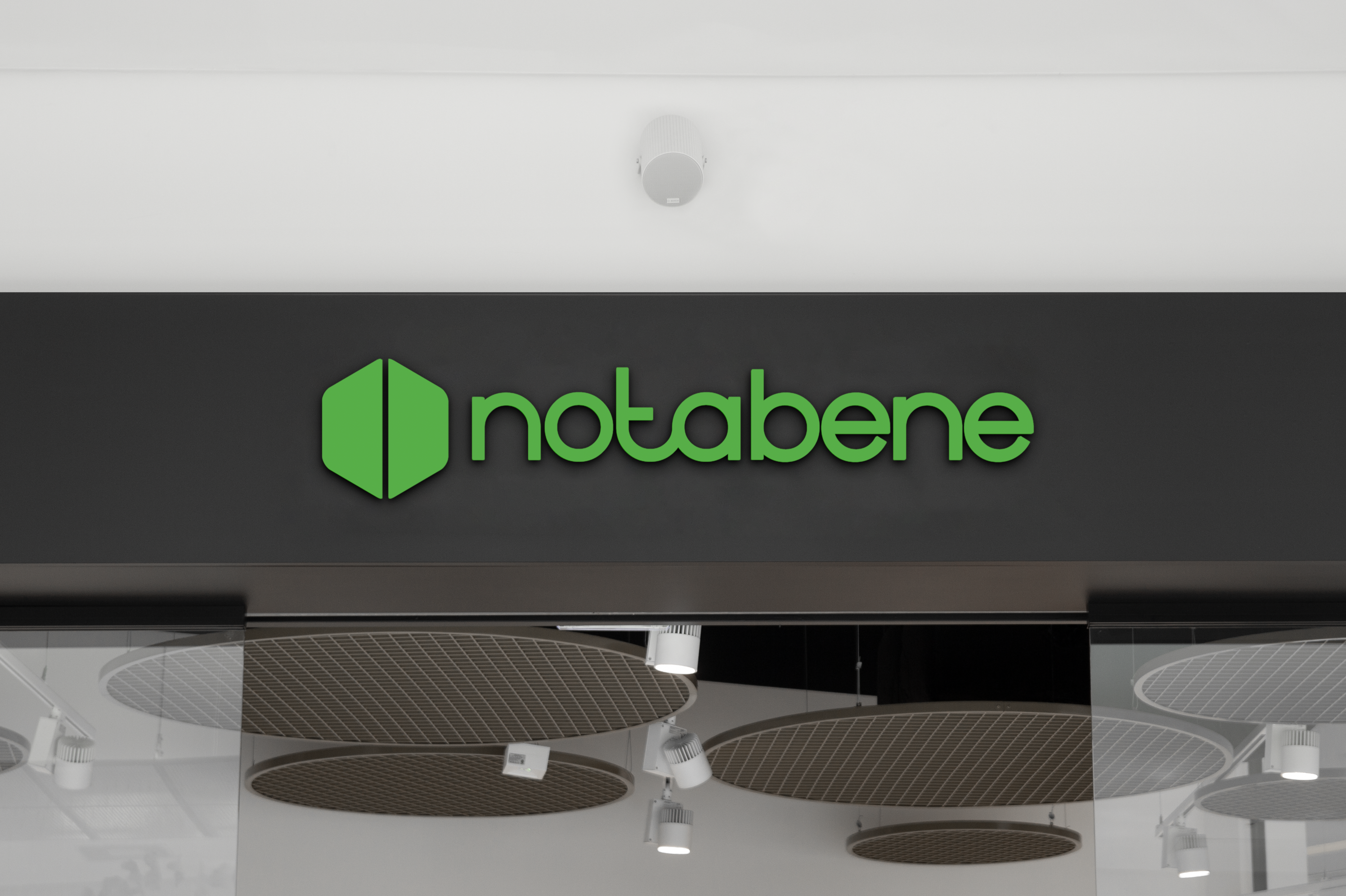
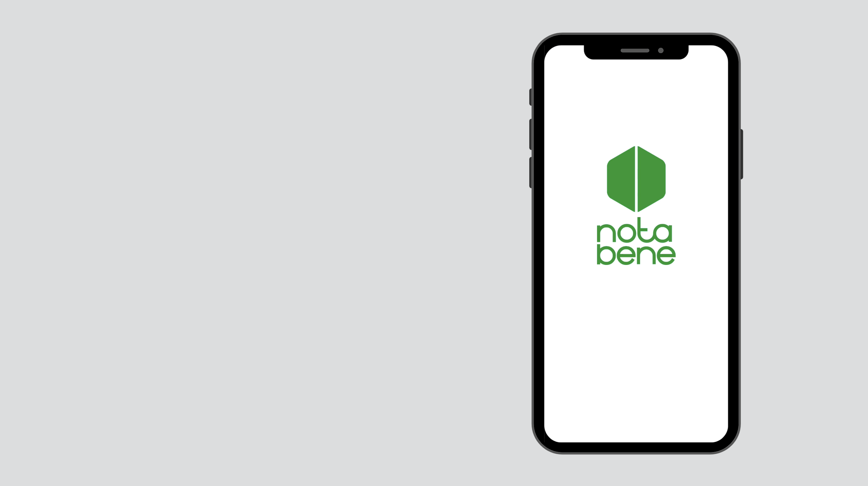
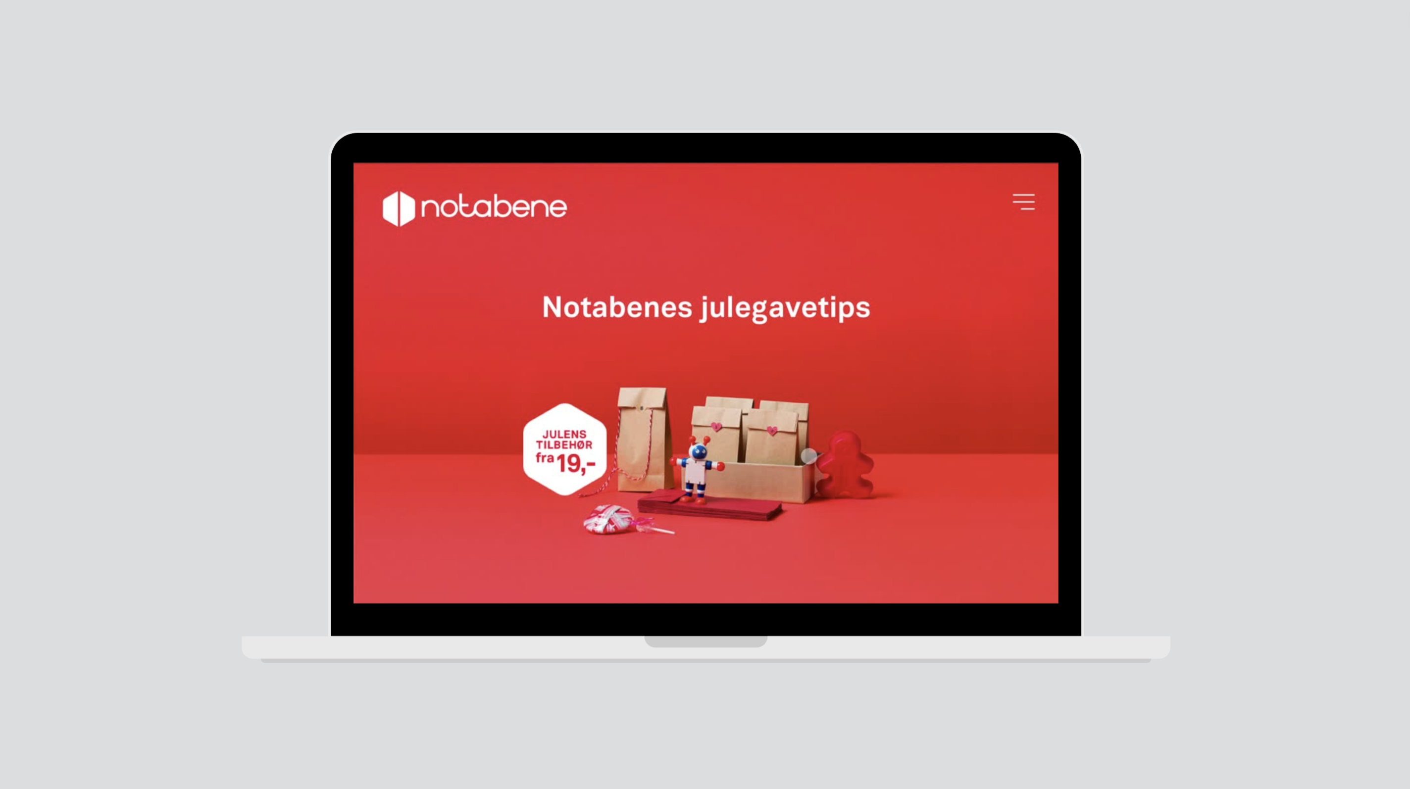
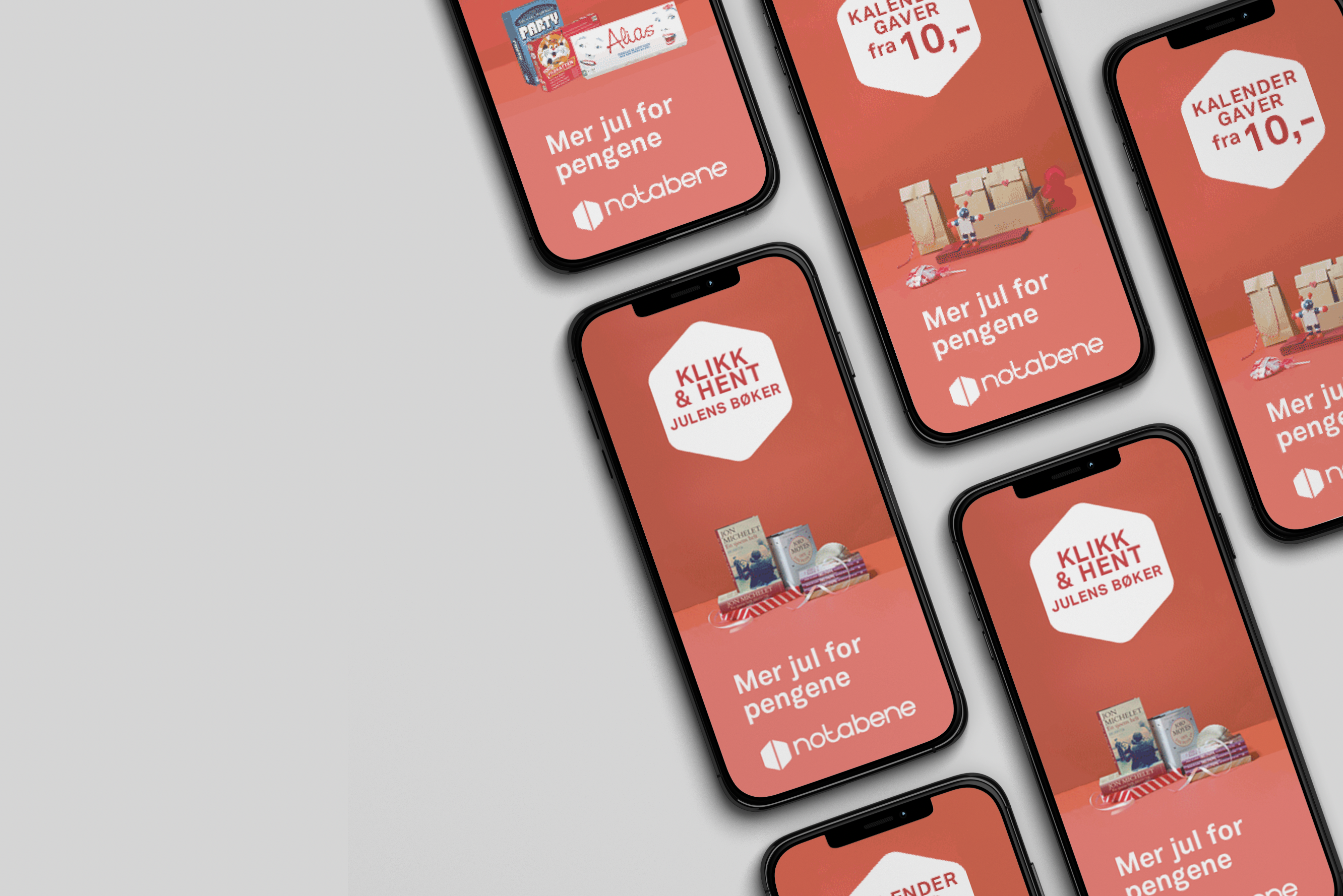
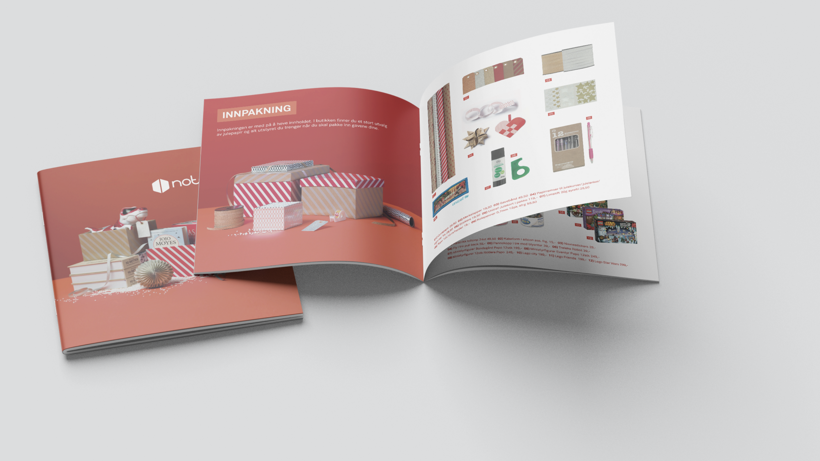
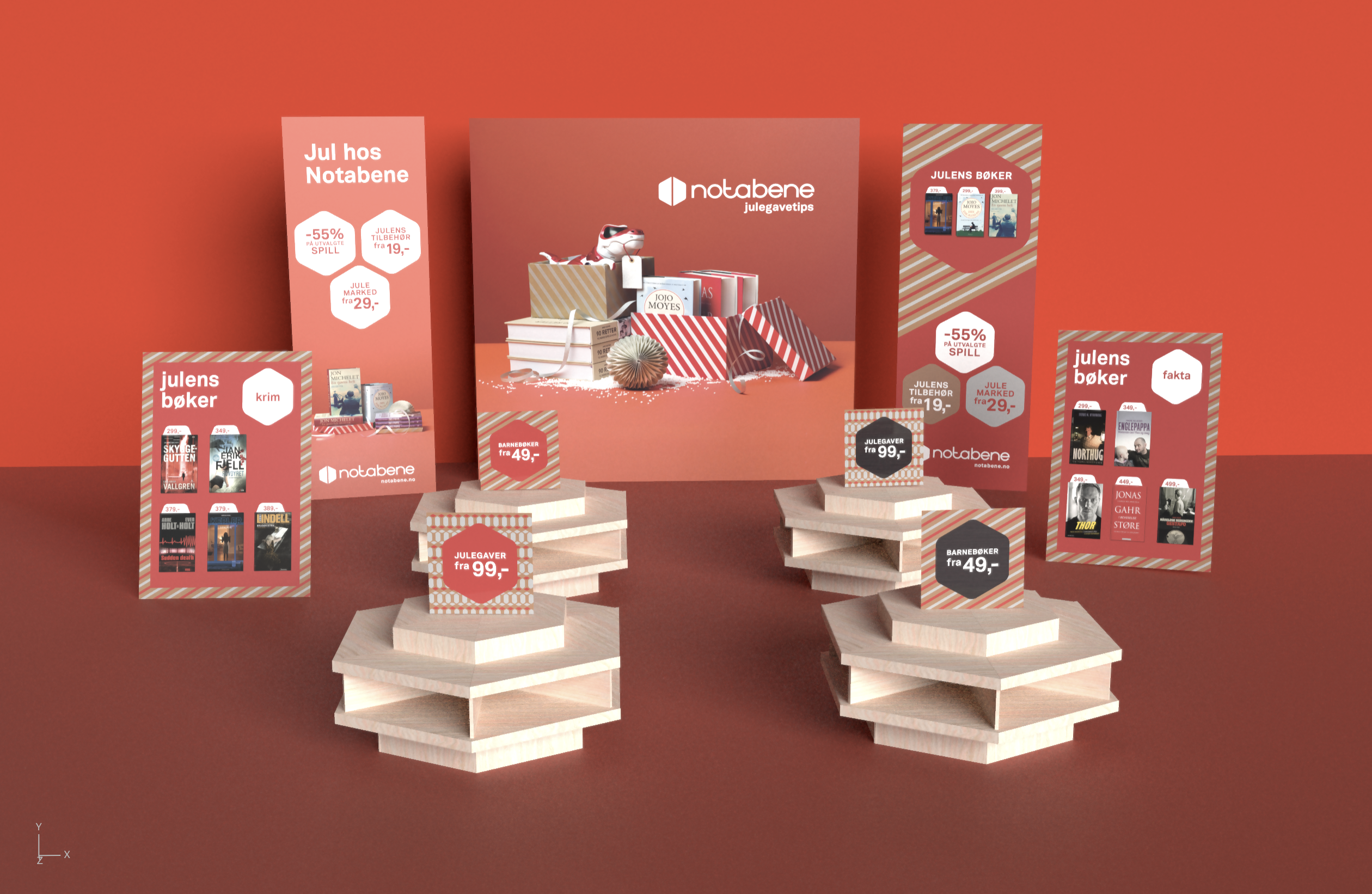
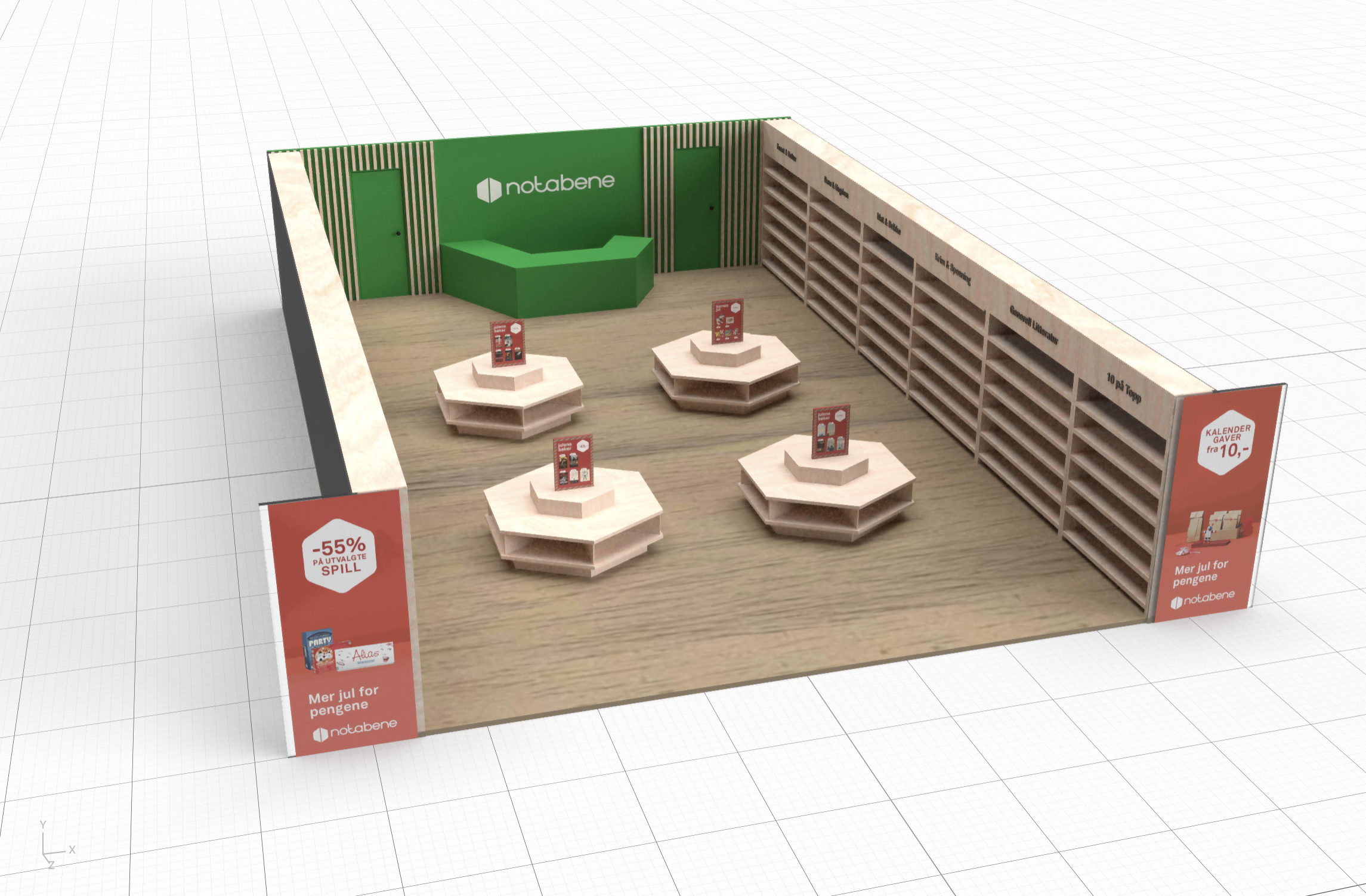
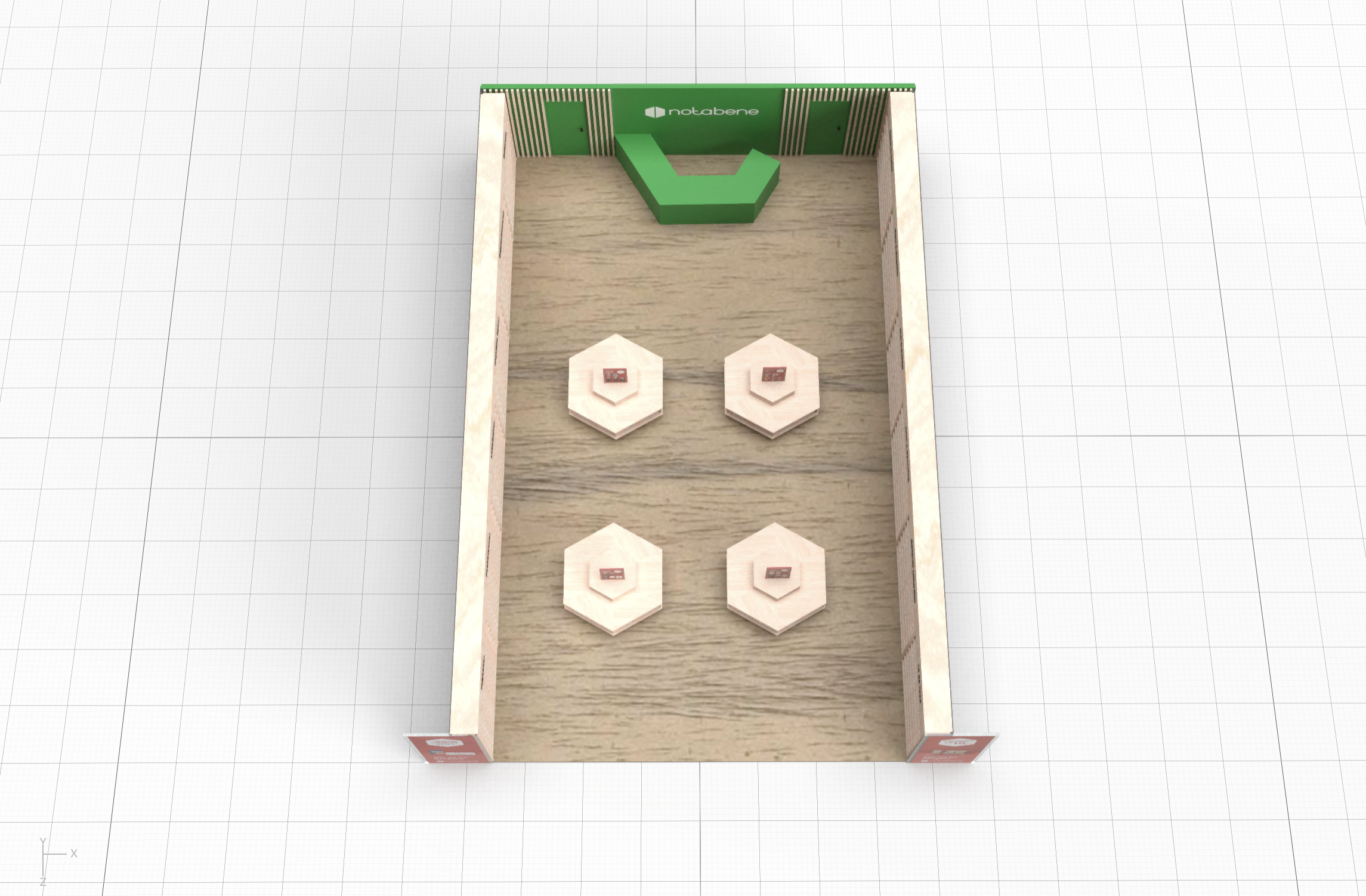
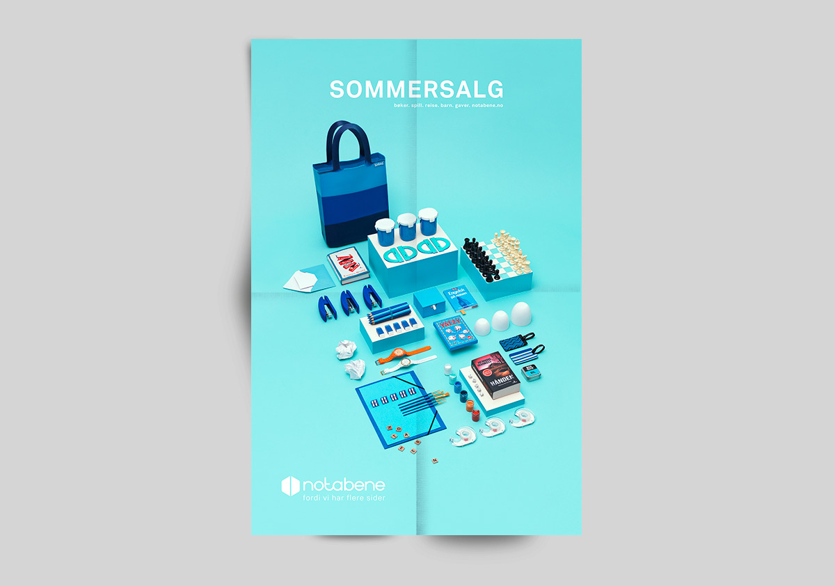
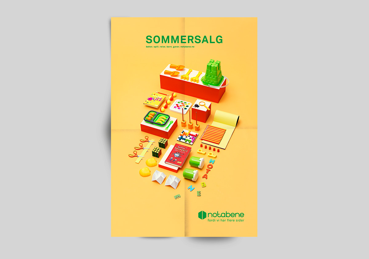
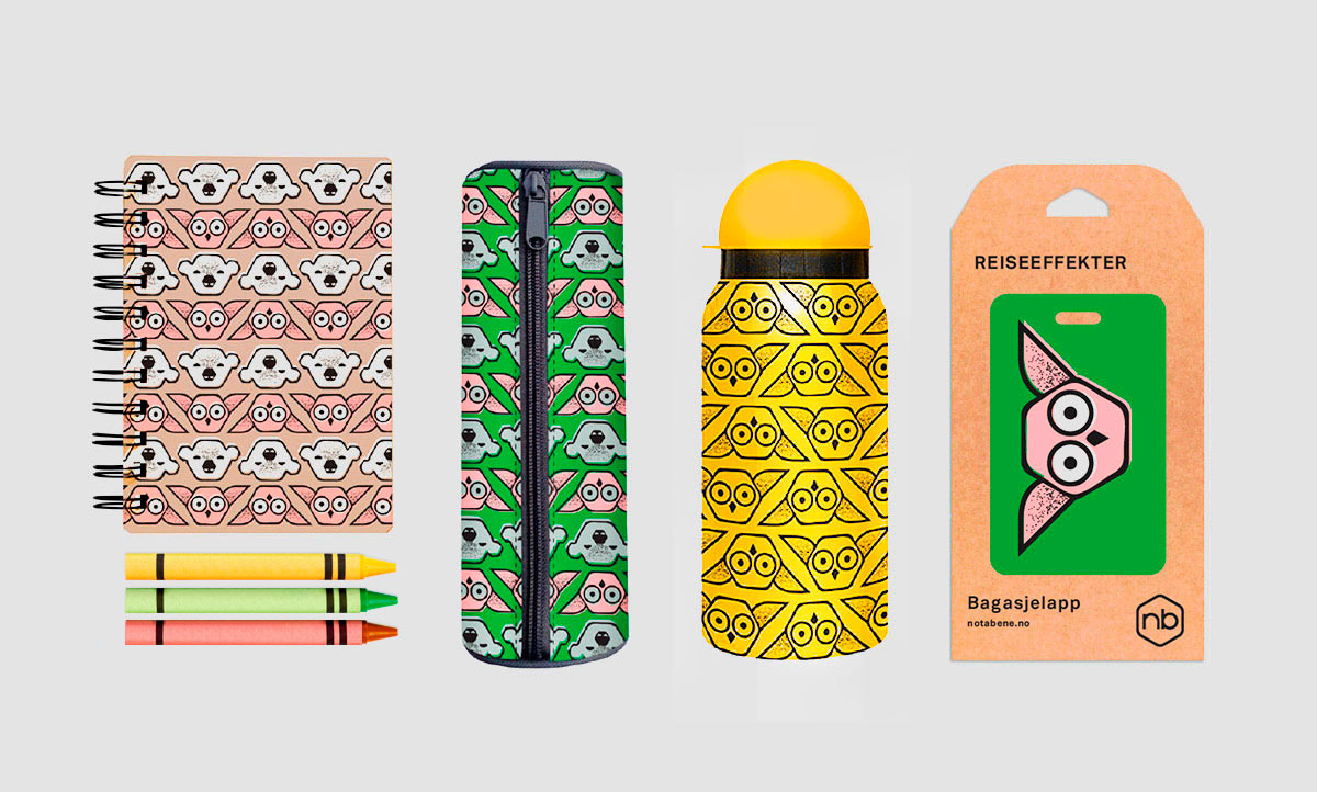
Notabene, one of Norway’s largest bookstore chains, came to us to develop a new identity. Notabene wanted to position itself as the bookstore that sells more than just books. They started focusing on not only books, but games, travel, children, and gifts as well. The idea behind the logo’s symbol is to be able to associate it with an open book, a dice, a toy, a thing. We have also used the hexagon throughout the profile program. You will find it again in the patterns, like sales bombs, posters, and in the illustrations of the house-style products.