Tindre Design is a small design agency located in Oslo, Norway. We deliver unique and effective solutions that strengthen our clients and make them stand out amongst their competitors.
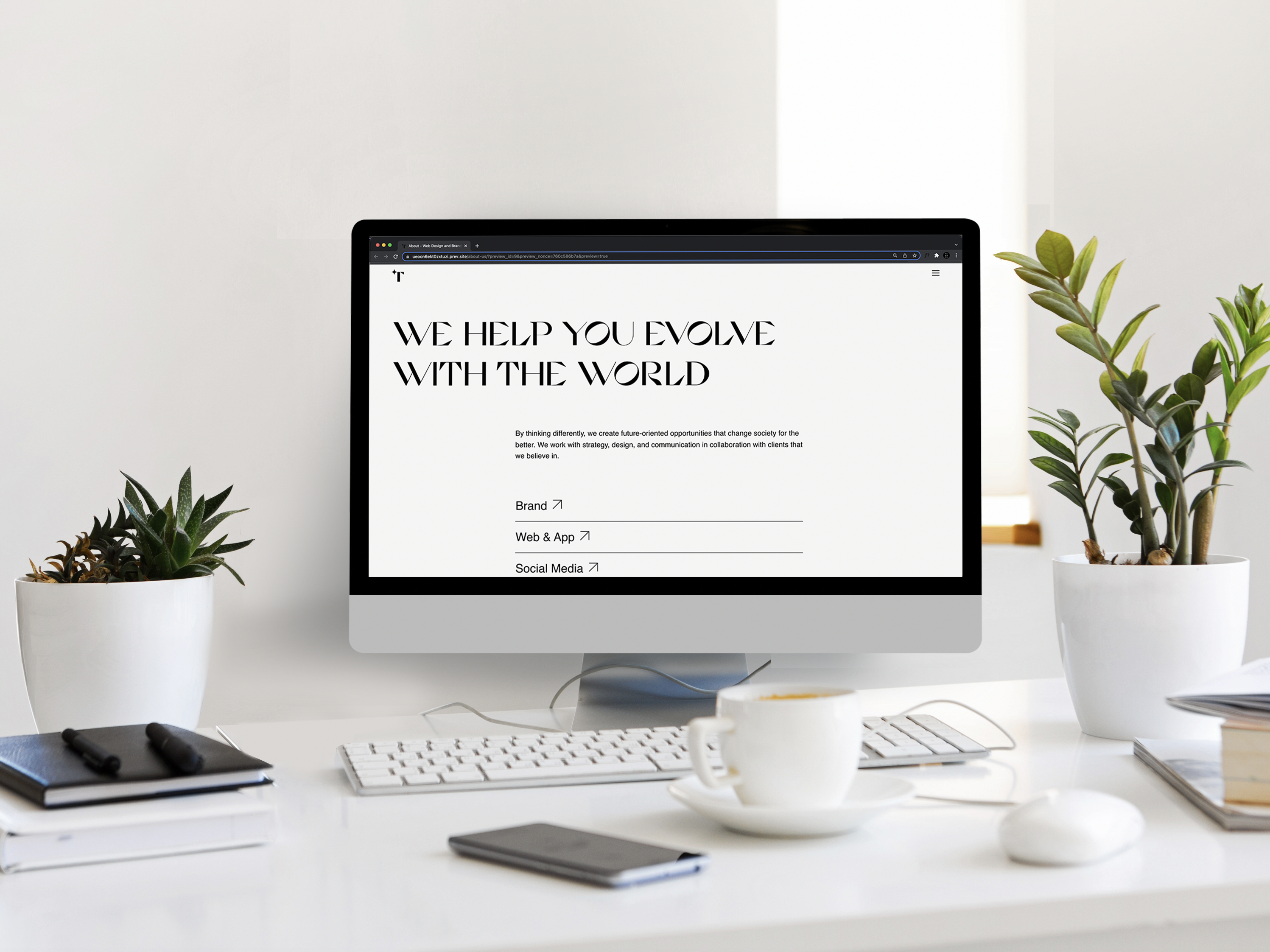
For Tindre’s rebrand, we upgraded the graphic profile, designed and developed a new website, as well as a social media strategy. In this project, we worked on a refresh of Tindre’s visual identity that captures our agency’s playful, ambitious, and brave personality and reimagines it for the future.
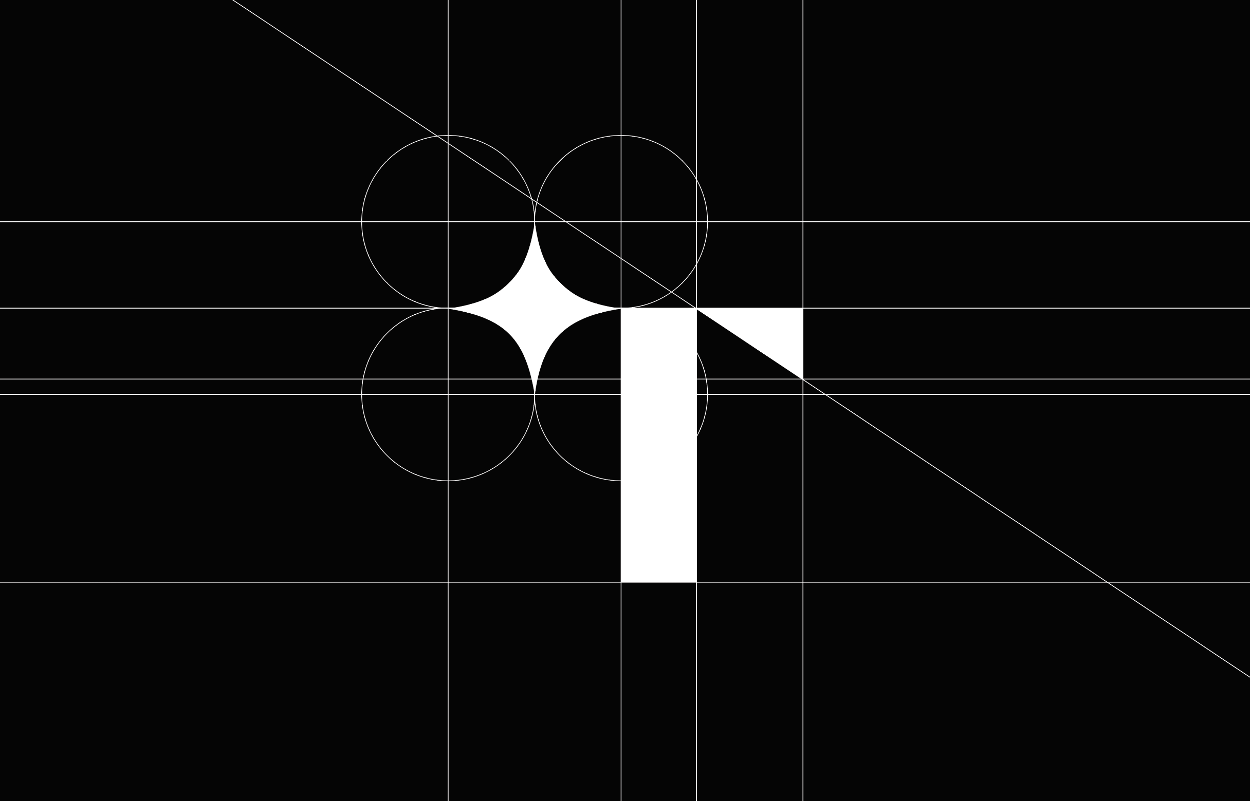
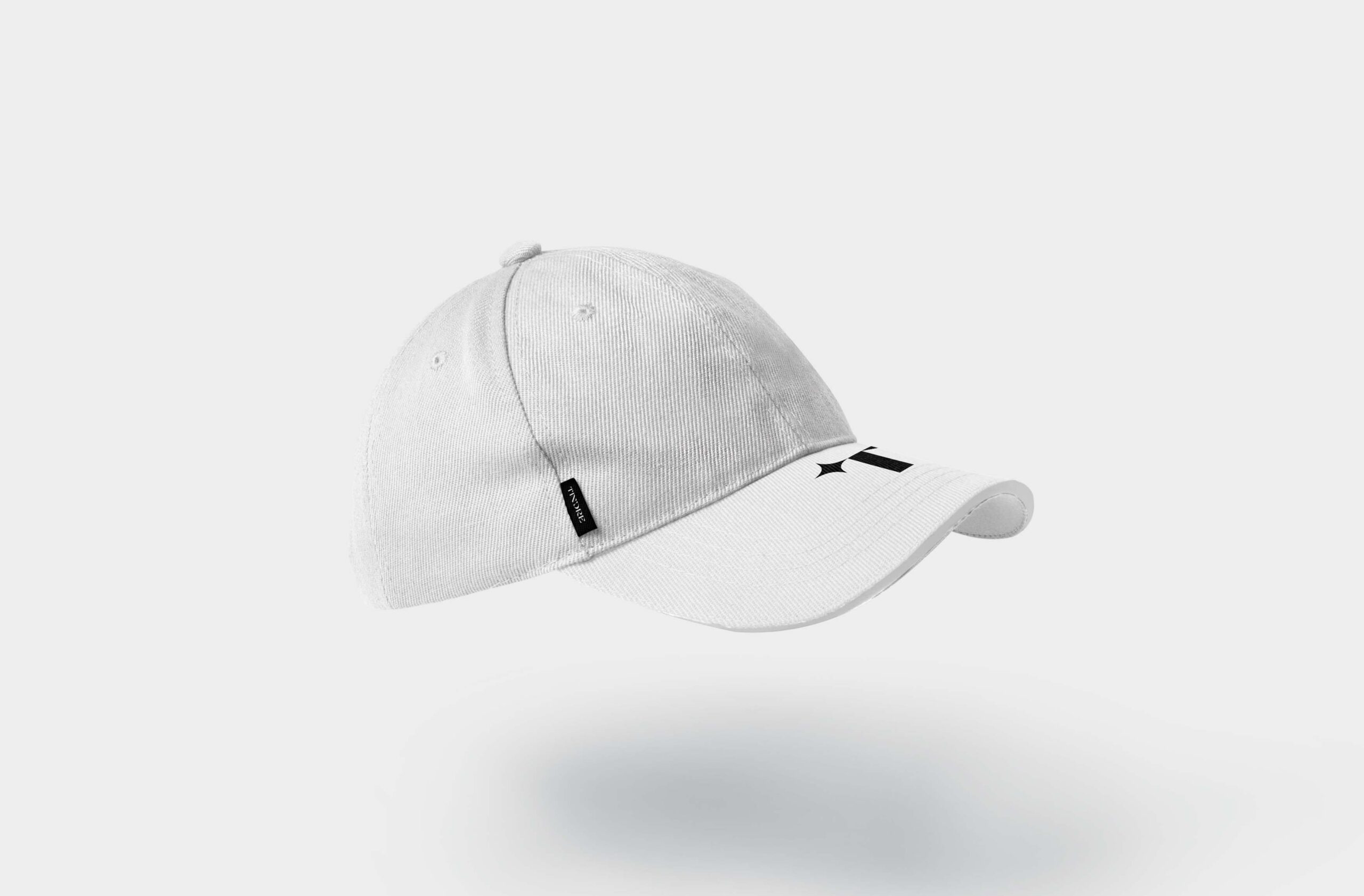
The new brand identity reflects a new brand strategy for Tindre Design that focuses on helping companies and brands in Norway accomplish their goals by creating unique and targeted design solutions of high quality. Since Tindre Design started up in 2004, the market of design agencies has grown a significant amount. Tindre’s new brand identity will be recognized as a small design agency that spreads joy around complicated processes and makes companies and brands feel like we are the go-to design agency, recognizable as an inspirational advisor and as a good alternative to the marketleader. The strategy positions Tindre Design as an “empowering brand,” helping you connect with your audience. The idea is neatly visualized in Tindre’s star, a symbol that communicates empowerment. The star is used by Tindre Design as a metaphor for guiding people forward along their professional journey no matter where they are located.
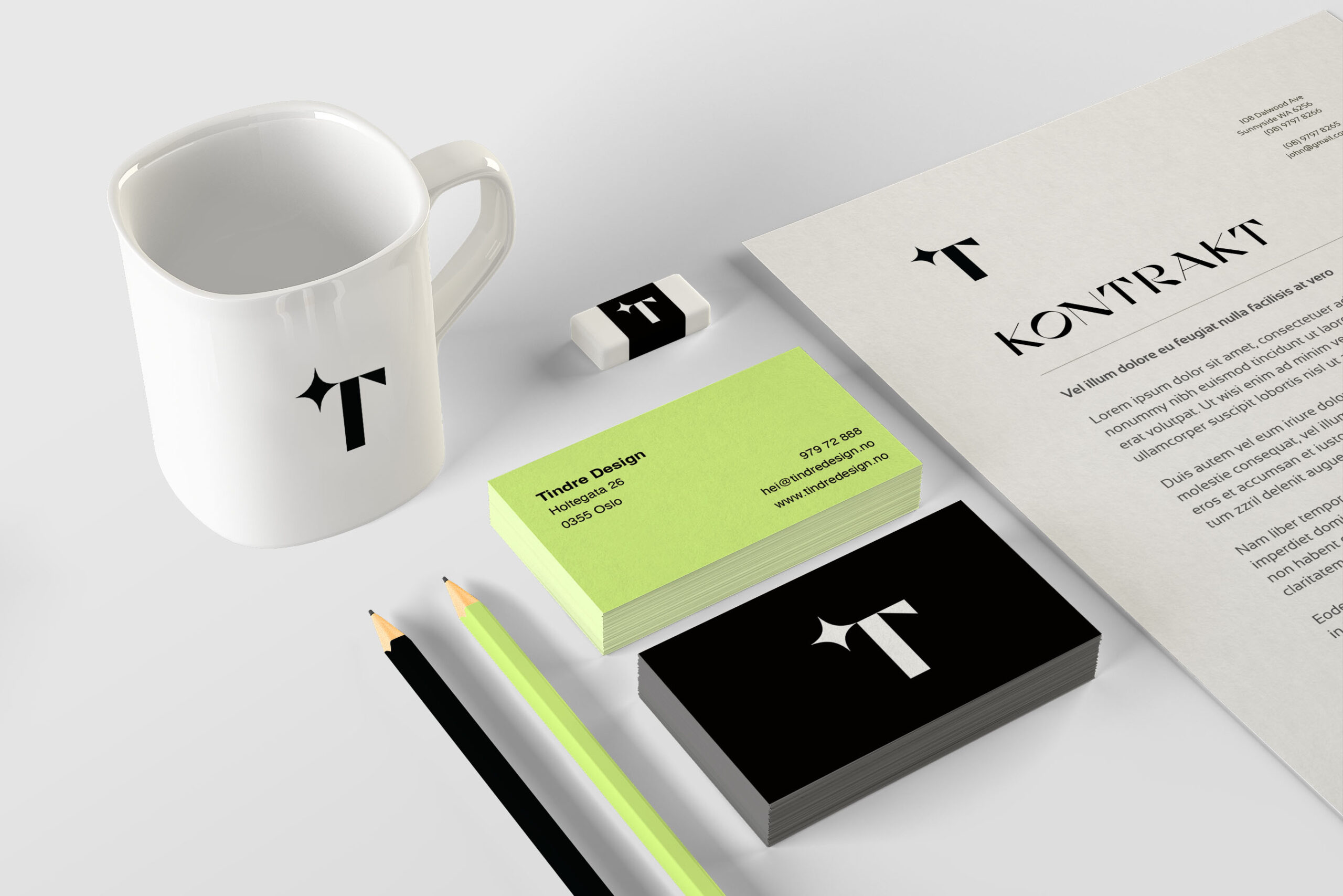
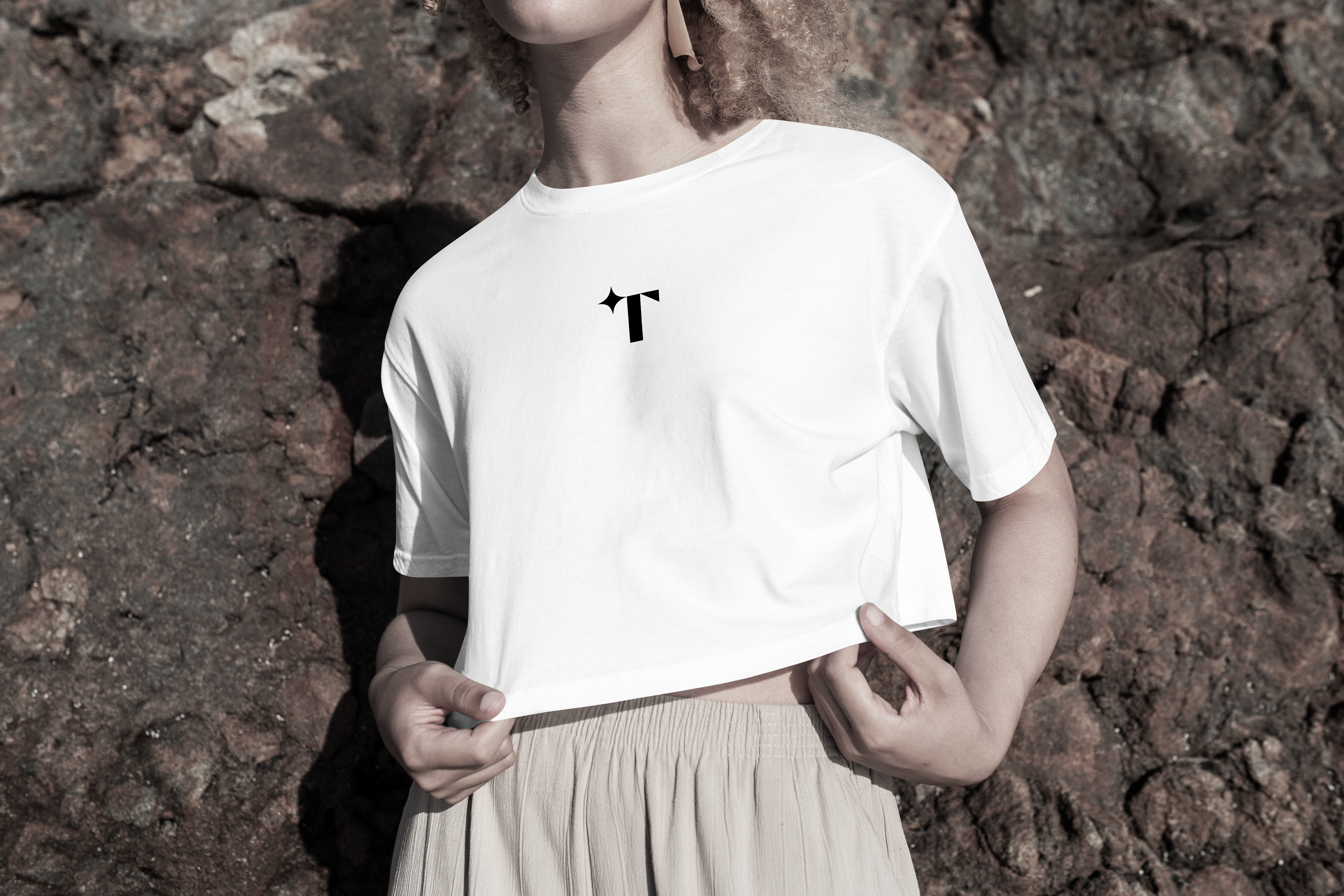
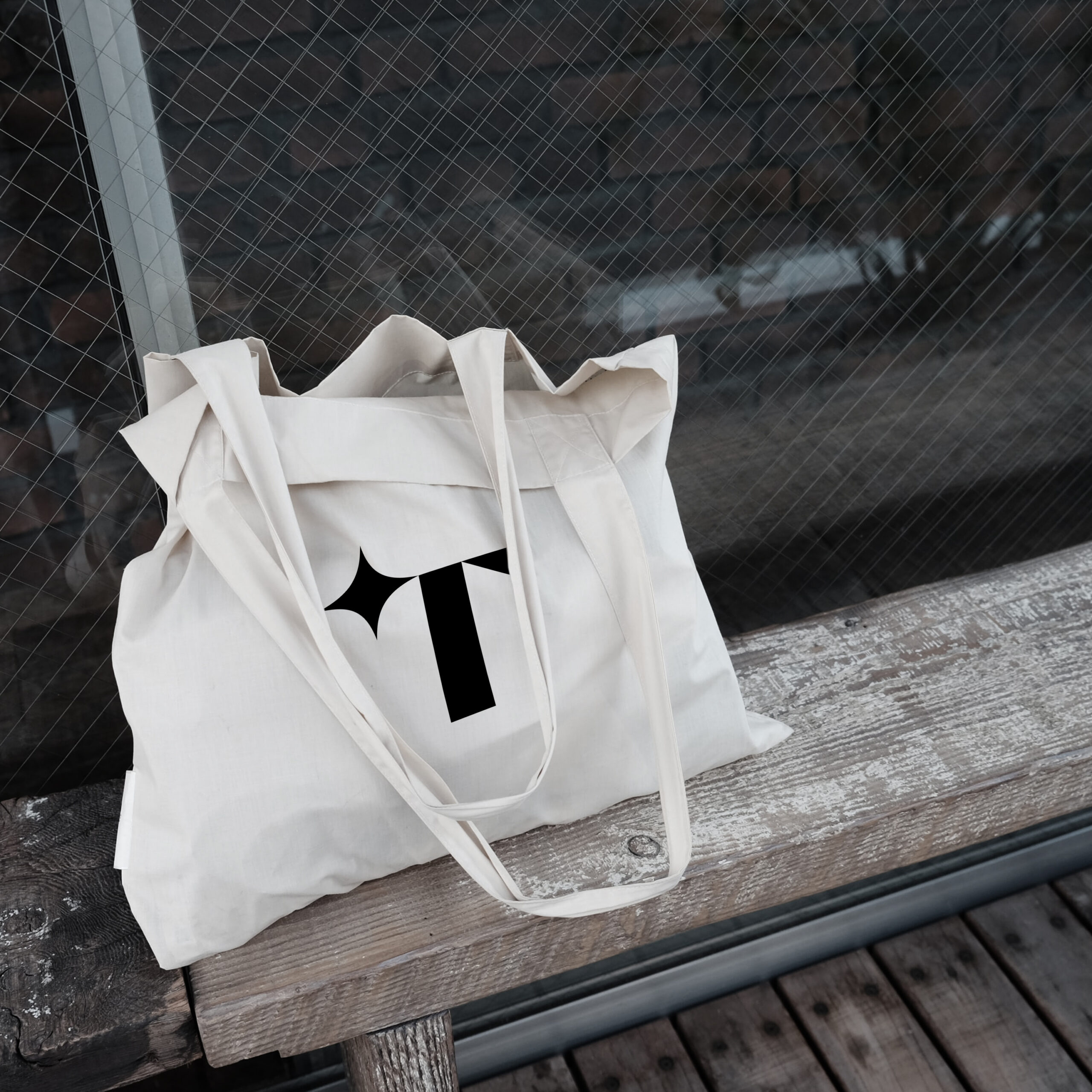
This strategy of strengthening and empowerment is expressed in our new logo that is simpler but more powerful. The typographic logo consists of just one letter with a little twist to it. When designing the logo, we worked on iterations to evaluate a wide range of options, some more like the previous logo, and some were completely new. The Tindre team discussed and completed research as part of the process.
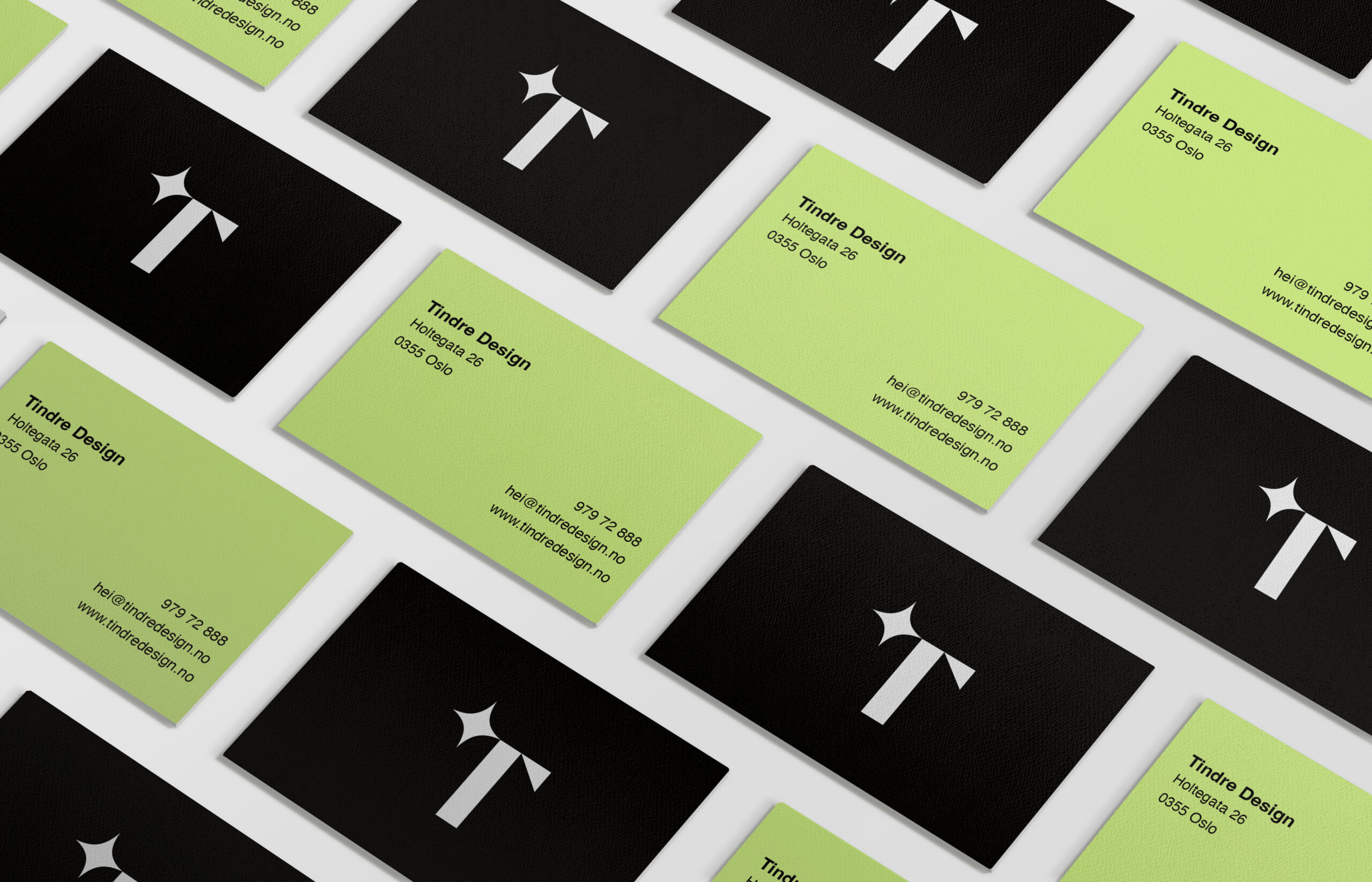
The logo has been optimized to work across different platforms and scales. The identity is streamlined with a simple “T,” and it was also decided to not have a secondary logo with “Tindre Design” in it because the “T” with the star is such a strong symbol/letter that we want to be recognized as the only logo/symbol of our design agency.
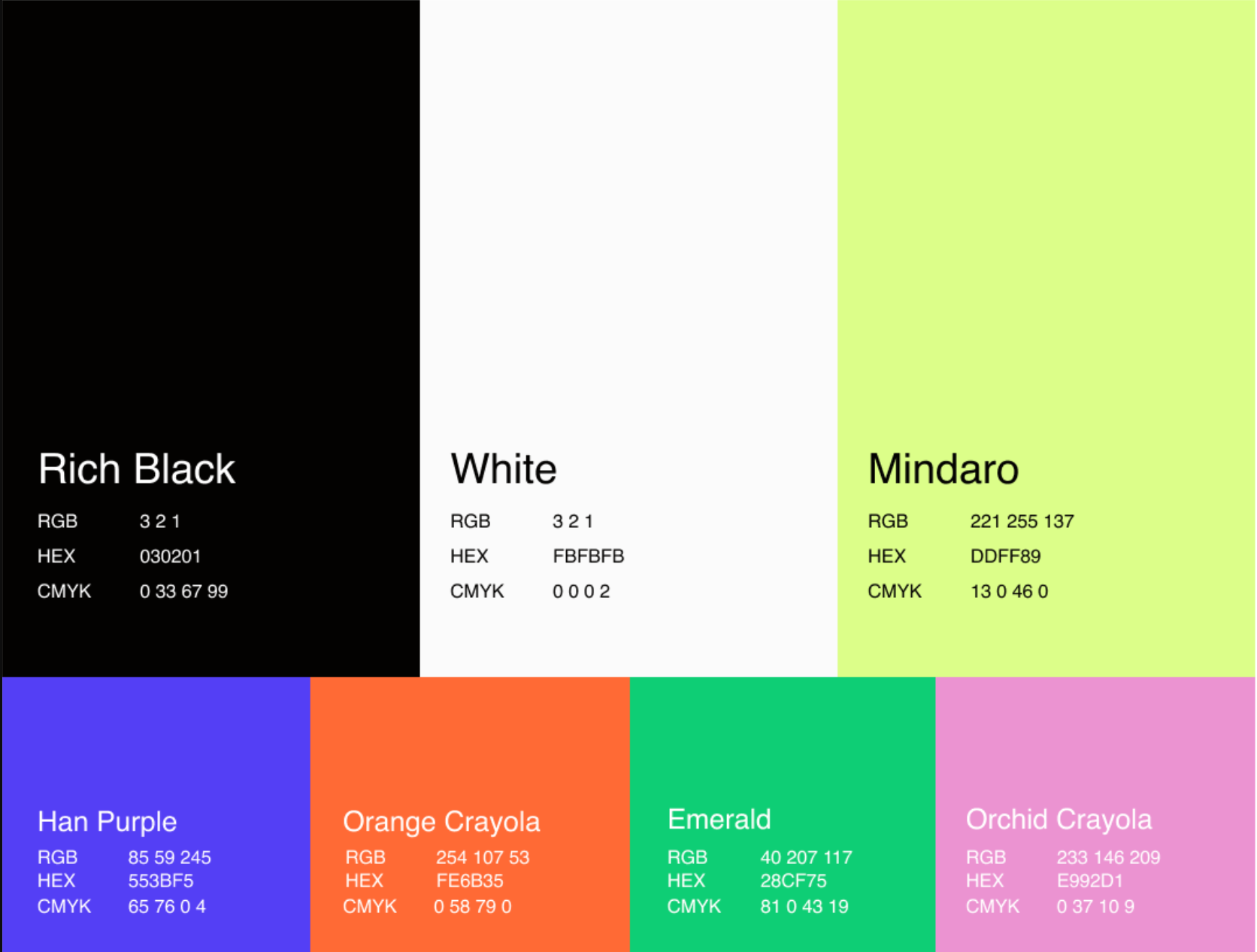
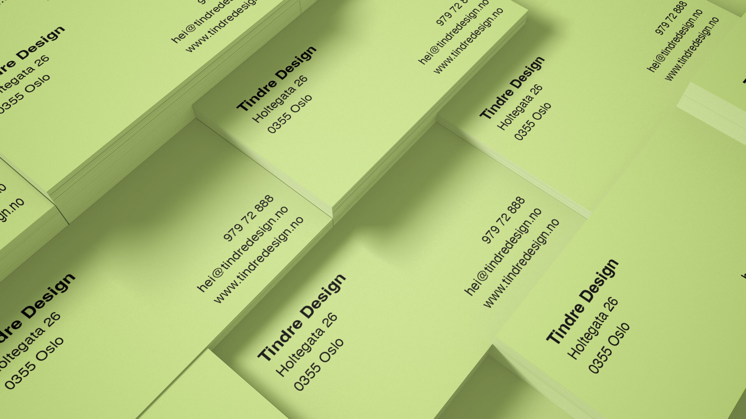
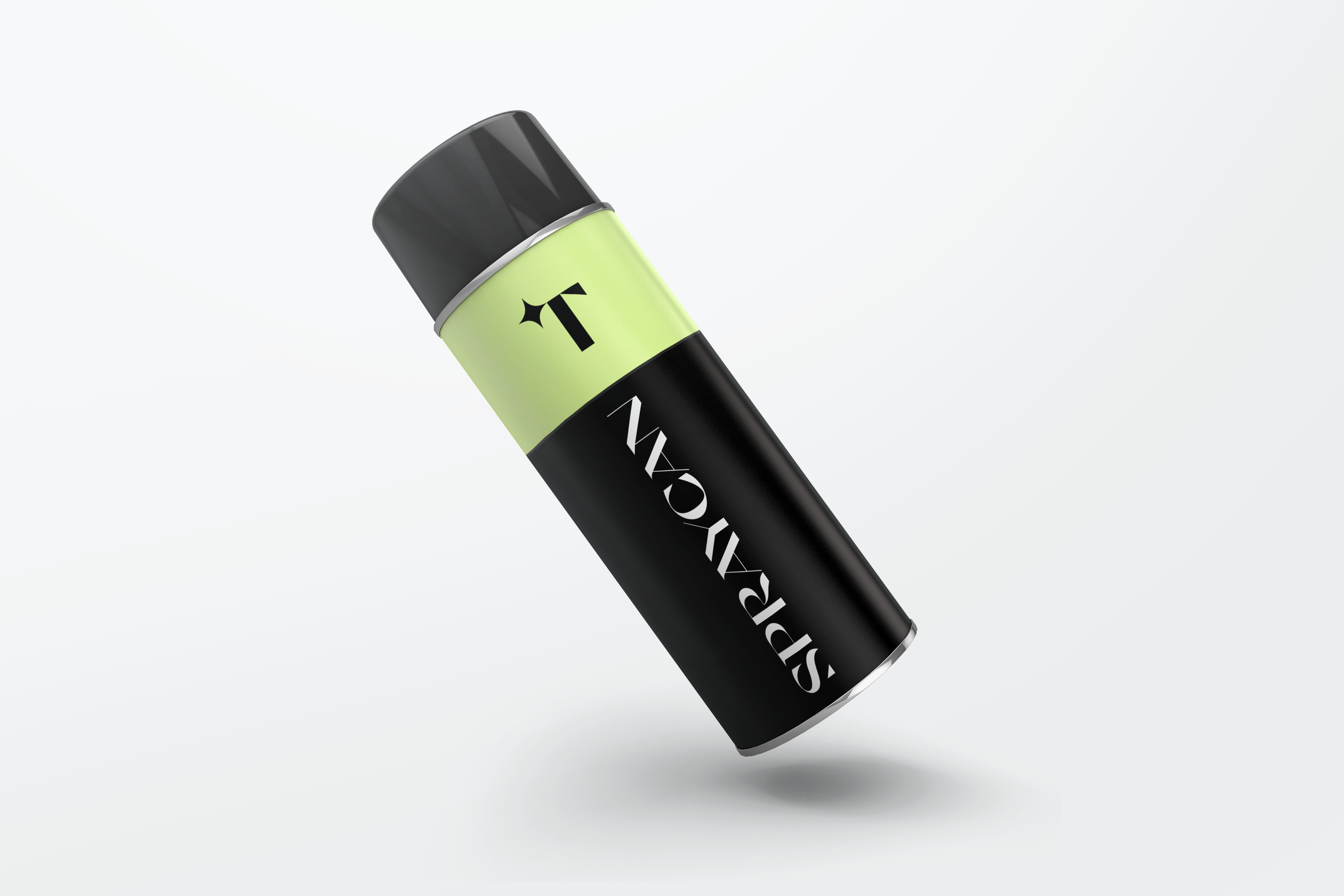
The primary brand color is a bright neon yellow, which is our new signature color. The designer refined the palette with other bright colors that go with our personality. Our secondary color palette is a bit more colorful, consisting of Han Purple, Orange Crayola, Emerald and, Orchid Crayola.
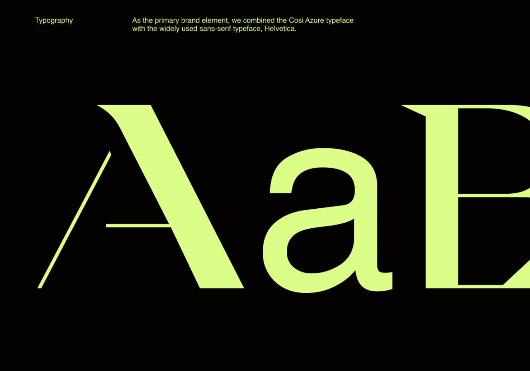
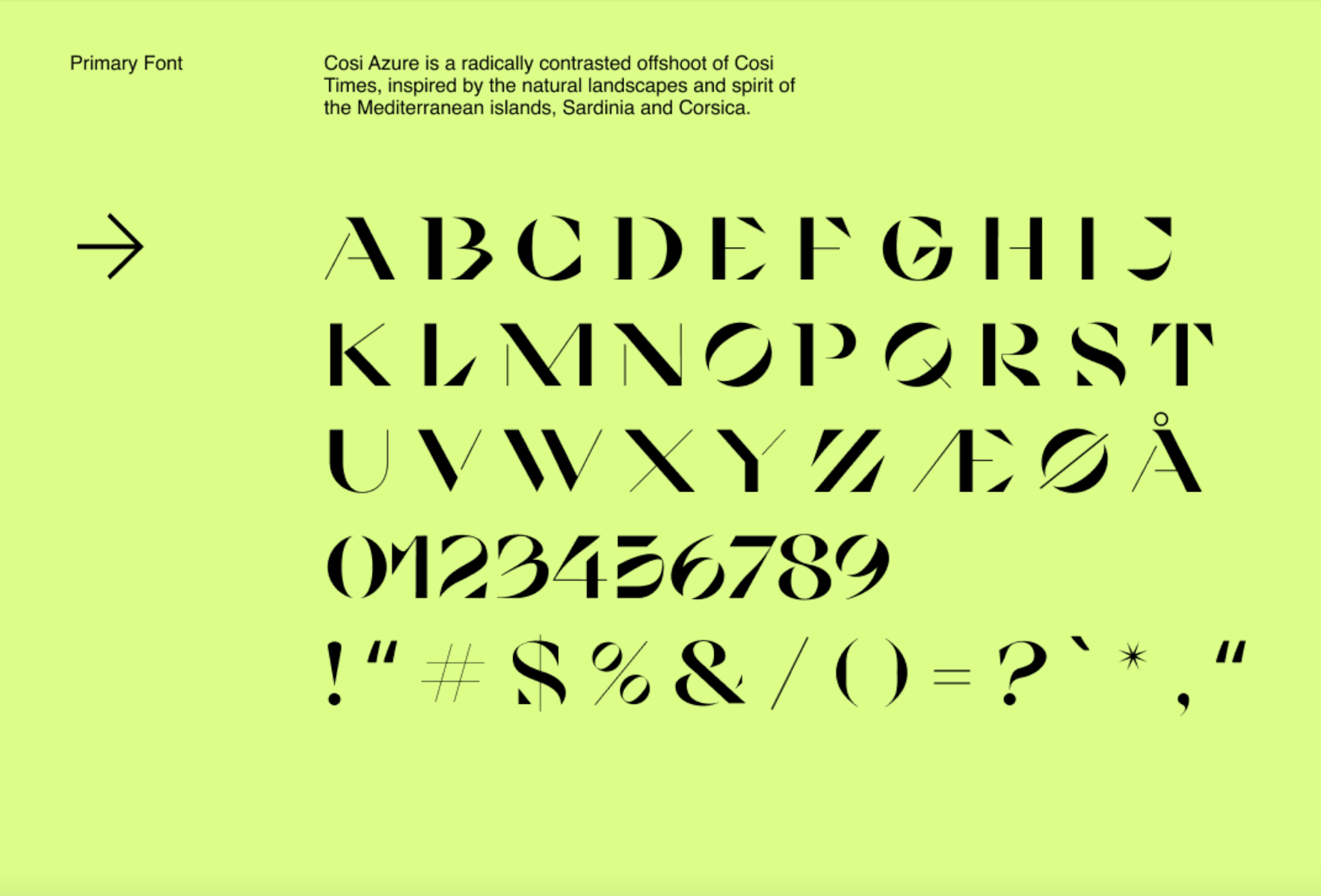
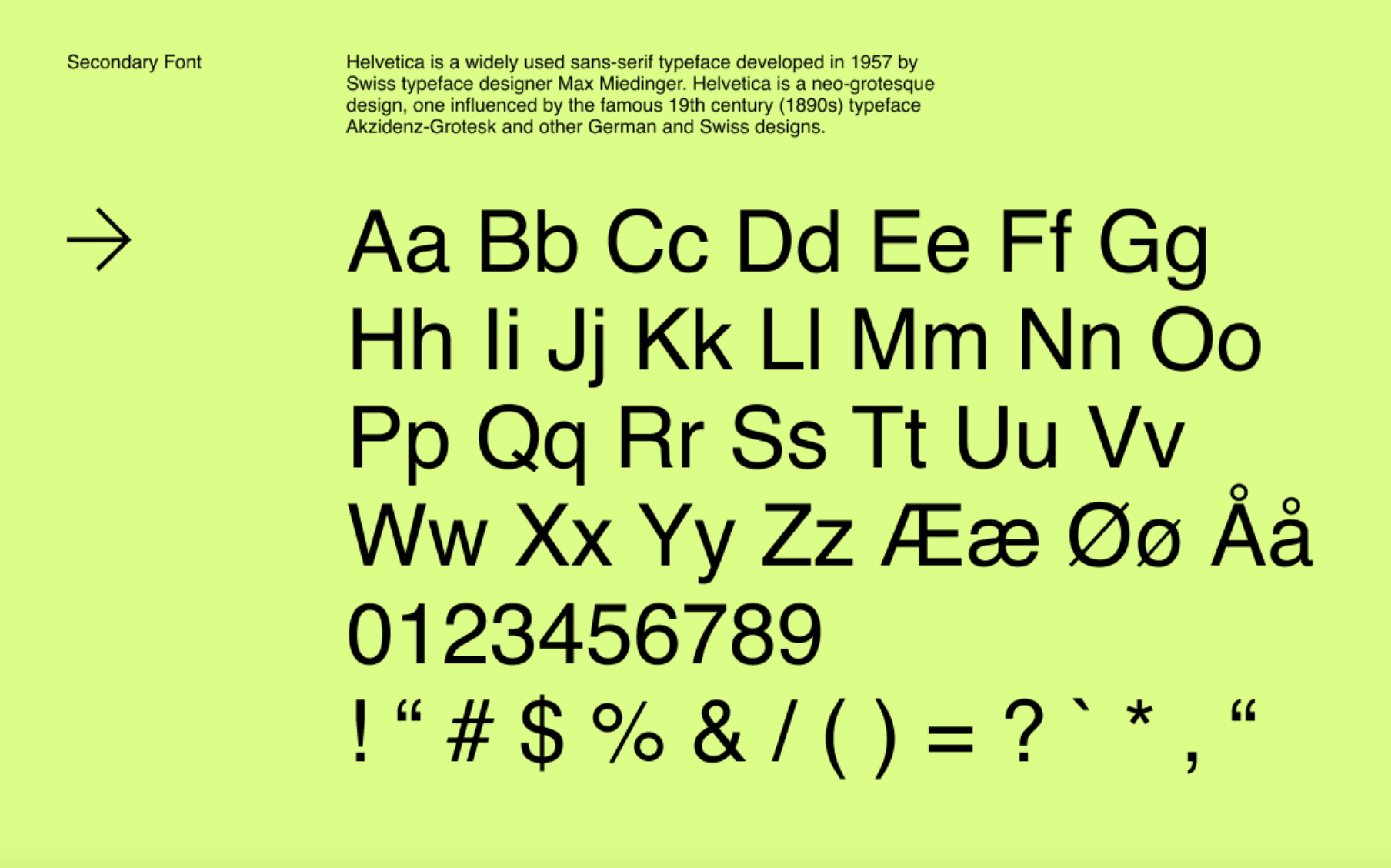
Like the logo, the Cosi Azure typeface designed by Nikolas Wrobel represents Tindre’s personality. The typeface has delicate and pointed forms that are counterpoised with bolder and wilder chunks, which evokes the sweet air, pointed peaks, and a soothing sound of the Mediterranean Sea which it was inspired by. We thought it fit our brand’s personality because we want our clients to feel like their collaboration with us feels like a breath of fresh air that brings them to the top of the pointed peaks. As the primary brand element, we combined the Cosi Azure typeface with the widely used sans-serif typeface, Helvetica.